All About Texture in Interior Design: Why It Matters and How to Use It
6 February, 2026
⚪
Johansson
Home > Blog > This Blog

I’m sure at some point in your life, you’ve walked into someone’s home and felt that the interior checked every box: coordinated colors, well-placed furniture, ideal layout; yet something felt off. Even in my own consultations, I’ve seen this play out countless times. You’ll be surprised to know that the culprit is almost always the same: texture. Or rather, a lack thereof.
Most people obsess over paint swatches and sofa styles, but texture is what makes a room feel like a space one can live in. According to a recent industry survey, the use of textured materials in home decoration has jumped by 40%. It tells you that homeowners are waking up to the fact that one-dimensional spaces just don’t work.
With this blog, I aim to break down what texture in interior design actually means, why it matters for both comfort and aesthetics, and finally, ways to add texture to a room tastefully, without overdoing it.
Whether you’re building new, remodelling, or just scratching your head trying to figure out why your living room feels sterile, this content piece is for you.
Before I delve into the more technical aspects of using texture, let’s make sure we’re speaking the same language. Texture in interior design refers to the surface quality of materials (how they feel to the touch and how they appear to the eye). There are two types of texture in interior design, and understanding both is essential to getting this design element right.
Tactile texture refers to the physical properties of a surface that create a tactile sensation. Run your hand across your couch, sink your feet into a wool rug, or touch the cool marble floor; that’s tactile texture. It’s three-dimensional, tangible, and your body responds to it, whether you’re consciously aware of it or not.
I explain tactical texture to my clients like this: it's how your home greets you physically. A velvet sofa invites a different sitting than a stiff leather chair. A reclaimed wood table asks to be trusted with your personal items and decor. These aren’t just aesthetic choices. They also shape how people interact with your space.
Visual texture in interior design is all about optics. Here, the perception of texture is created through color, pattern, light, and finish, even if the surface itself might be smooth.
For example, a wallpaper designed to look like exposed brick feels like flat paper to touch, but your eyes register depth and roughness at first. Similarly, high visual texture (grain variations, patterns, material contrasts) makes rooms feel more intimate; while low visual texture (solid colors, matte finishes) makes rooms feel more calm and expansive.
These get confused constantly, so let me clarify. Material is the substance: wood, metal, fabric, glass. Pattern is visual repetition: stripes, geometrics, florals. Texture is how materials are finished and perceived. The same wood can be rough-hewn or polished smooth; each treatment creates an entirely different interior design texture.
Strong interiors use all three intentionally. Material variety without texture feels flat. Heavy pattern without texture feels busy. When they work together, spaces feel layered and cohesive.

At this point, you might be wondering whether all this fuss about surface quality is really necessary. The short answer: absolutely. It isn't just a decorative tool. Texture helps determine how a space performs both visually and emotionally.
Every object carries "visual weight" or perceived heaviness unrelated to actual pounds. Texture drives this perception significantly.
Rough texture in interior design looks heavier. A chunky knit throw appears more substantial than a silk scarf at the same actual weight. A stone fireplace commands more attention than painted drywall. By mixing textures in interior design strategically, you balance this weight across a room.
Practical example: a space dominated by smooth surfaces like glass tables, metal lamps, and leather seating feels slippery and ungrounded. Adding a jute rug or a bouclé armchair "anchors" it. Conversely, if everything feels heavy and cluttered, a smooth texture in interior design lightens things up.
Beyond visuals, textures function as mood setters, something that us design researchers have studied extensively.
Rough and soft textures (raw wood, brick, wool, velvet) signal warmth and comfort. They absorb light and sound, making rooms quieter and cozier. Smooth, hard textures (glass, chrome, polished stone) reflect light and sound. They feel cooler, more formal, more energetic.
If your home doesn't feel like "you," it might be a texture mismatch. Wanting a cozy sanctuary while filling your space with chrome and glass? That's a losing battle.
If you love neutrals like whites, beiges, soft grays, then texture isn't optional. It's mandatory. Without color variation, texture in a room does all the heavy lifting.
An all-white room with smooth walls and plain cotton bedding looks institutional. The same white room with painted brick walls, a sheepskin rug, a velvet sofa, and linen curtains? Luxurious. The shadows from varied textures replace contrasting colors. According to industry reports, walls are increasingly treated as design elements through textured finishes rather than flat backdrops.
To use texture effectively, you need to understand the range available to you. Think of it like a painter's color palette, except instead of hues, you're working with surface qualities.
Rough textures are grounding forces: organic, earthy, often imperfect. I use them to add character to spaces that feel too new or sterile.
Examples: exposed brick, reclaimed wood, stucco walls, sisal rugs, rattan furniture, unpolished stone. These materials absorb light, creating shadows that make large rooms feel intimate. Just don't overdo it; too much rough texture and your space starts resembling a barn.
Smooth textures define contemporary design: polished marble, glass, acrylic, stainless steel, silk, lacquer finishes. These surfaces reflect light and bounce it around.
This makes smooth-textured interior design useful in small spaces. Light reflection tricks the eye into perceiving more square footage. It also reads as sophisticated and clean.
Between rough and high-gloss sits the workhorse zone. Matte painted walls, cotton sofas, and honed granite all provide neutral backdrops that let more extreme textures pop. Most successful rooms have foundations built on middle-ground textures, with rough and smooth layered on top.
Theory is helpful, but you came here for actionable advice. So let's talk about how to add texture to a room without making it look like a textile sample library exploded.
The key is layering. Build texture gradually, starting from the architectural shell of the room and working inward toward accessories.
Textiles are the easiest entry point. Start with the floor: a high-pile Berber rug for softness, or a flat-weave kilim for visual texture in interior design through pattern. Pro tip: layer a smaller patterned rug over a large neutral jute rug for instant depth.
Then consider upholstery. A linen sofa with velvet cushions and a chunky knit throw creates three distinct tactile experiences in one seating area. Don't overlook curtains; they occupy major visual real estate.
Walls are your largest surfaces, and the texture added there has a major impact. The era of flat-painted drywall is fading. Designers reach for limewash, decorative plaster, wood paneling, and appropriate wallpapers, while limewash remains among the top wall treatments. These finishes catch light differently throughout the day, turning simple rooms into dynamic experiences.
Furniture carries texture, too. A rustic oak coffee table tells a different story than glossy lacquer. Wicker and upholstered pieces belong in entirely different visual categories.
Decorative objects layer in more opportunities: smooth glass vase next to rough ceramic pot, worn leather books beside polished metal lamp, sculptural art, and woven baskets.
Nature is the original texture master. Plants bring complex, living texture; glossy fiddle leaf fig leaves contrast beautifully with feathery fern fronds or spiky succulents.
Beyond plants, organic objects (driftwood, dried flowers, stones) provide a "perfectly imperfect" texture that manufacturing can't replicate. Research found that people in environments with natural elements reported 15% higher well-being.
Now comes the art of it. How do you combine all these elements without creating visual chaos? Here are the guidelines I never fail to use in my own projects.
Contrast drives good design. If everything is smooth, nothing reads as smooth. You need roughness to appreciate smoothness.
Pair opposites deliberately: rough wood bowl on smooth glass table, silk pillow against rough linen sofa, shiny metal lamp against matte wall. This tension makes rooms feel dynamic. Smooth texture in interior design highlights rough, and rough makes smooth more apparent.
Aim for at least three different textures in any major vignette. Coffee table: smooth glass tray, rough stack of books, spiky plant. Sofa: the upholstery, a wool throw, and velvet pillows. This triad keeps eyes moving without overwhelming.
Working with one color family? Texture does all the heavy lifting. In an all-white room, painted brick differs from linen curtains, from velvet upholstery, from ceramic vases. Same color, entirely different feel.

This is where you can go all out with mixing textures in interior design. Layer rugs, mix lighting sources (lamp shades add texture), and keep soft fabrics within reach. Living room design is all about balancing softness with structured elements (wood coffee table, metal shelving) to maintain visual architecture.
Dial down visual noise and dial up tactile comfort in the bedroom. Focus on soft textures: high-thread-count sheets, heavy duvet, velvet headboard. Go easy on reflective surfaces that are too energetic for rest. And please, use a high-pile rug beside the bed. Cold flooring as your first morning sensation is nobody's idea of a good time.
Kitchen and bathroom are inherently "hard" rooms filled with cabinets, appliances, and tiles. Smooth texture interior design dominates by necessity, so your job is to soften it. Kitchen: wooden cutting boards, runner rugs, woven stools. Bathroom: fluffy towels, plush bath mat. Small additions, enormous impact.
All rough textures? Barn. All glossy surfaces? Clinic. Neither extreme works for everyday living. Balance isn't just a design principle, but a comfort requirement.
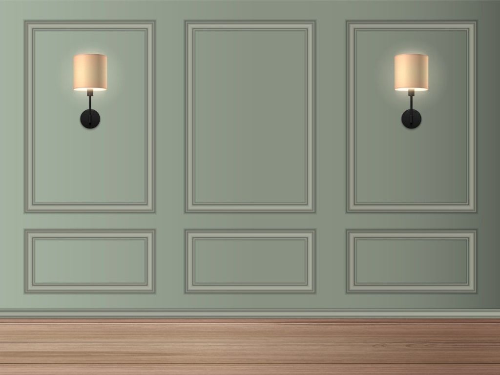
Texture needs light to be perceived. Poorly lit rooms make beautiful textured walls look like dark smudges. "Grazing" light that hits surfaces at steep angles highlights rough texture in interior design effectively. Consider wall sconces positioned to emphasize your textural choices.
Ceilings are prime textural real estate. High-gloss paint reflects light and opens rooms up. Exposed wood beams add character. Textured plaster creates overhead interest. Don't neglect the surface covering your entire room.
Texture in interior design refers to how surfaces feel or appear to feel. It includes both tactile texture (what you can physically touch) and visual texture (what your eyes perceive), and it plays a major role in how comfortable and inviting a space feels.
The easiest approach is through textiles and accessories. Rugs, cushions, throws, curtains, plants, and natural materials like wood or stone instantly add depth without requiring any structural changes. Swapping out smooth cushion covers for textured ones can smooth-texture their feel in an afternoon.
Absolutely. Minimalist interiors often rely on texture more heavily than color because they can't depend on bold hues for visual interest. Subtle variations like matte walls, linen upholstery, smooth stone, and visible wood grain create depth while maintaining a clean, uncluttered aesthetic.
Using only one type. Too much smooth-textured interior design makes a space feel cold and clinical. Too much rough texture makes it feel heavy and rustic. The key is thoughtful contrast: balancing rough against smooth and soft against hard, so that each texture can be properly appreciated.
Significantly. The angle and quality of light determine how pronounced textures appear. Grazing light (light hitting a surface at a sharp angle) emphasizes texture dramatically, while flat, frontal light can flatten it. Consider your lighting plan alongside your texture choices for the best results.
Mastering texture in interior design is about learning to see and feel spaces differently. A room isn't just a visual composition. It's a sensory environment you'll move through, touch, and live within.
You don't need to overhaul your entire home. Look around right now. Does the space feel flat? Try a wicker basket, a textured pillow, a potted plant. Notice how light interacts with different surfaces.Small experiments teach you more than any article could. And if you're struggling to find that balance, or your home just doesn't feel finished despite having all the right furniture, getting an expert interior designer on board can help you weave these elements into something cohesive and beautiful. Give us a call at Johansson Design today, and let’s talk about taking your home interior to the next level with texture.